Tuesday, July 31, 2007

First hurricane paper of what promises to be a busy season

Holland and Webster in the Philosophical Transactions of the Royal Society

We find that long-period variations in tropical cyclone and hurricane frequency over the past century in the North Atlantic Ocean have occurred as three relatively stable regimes separated by sharp transitions. Each regime has seen 50% more cyclones and hurricanes than the previous regime and is associated with a distinct range of sea surface temperatures (SSTs) in the eastern Atlantic Ocean. Overall, there appears to have been a substantial 100-year trend leading to related increases of over 0.78C in SST and over 100% in tropical cyclone and hurricane numbers. It is concluded that the overall trend in SSTs, and tropical cyclone and hurricane numbers is substantially influenced by greenhouse warming. Superimposed on the evolving tropical cyclone and hurricane climatology is a completely independent oscillation manifested in the proportions of tropical cyclones that become major and minor hurricanes. This characteristic has no distinguishable net trend and appears to be associated with concomitant variations in the proportion of equatorial and higher latitude hurricane developments, perhaps arising from internal oscillations of the climate system. The period of enhanced major hurricane activity during 1945–1964 is consistent with a peak period in major hurricane proportions
It's a hot time out there in the Atlantic today

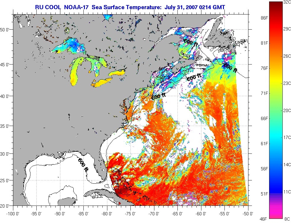
and the Gulf is turning into a hibatchi.
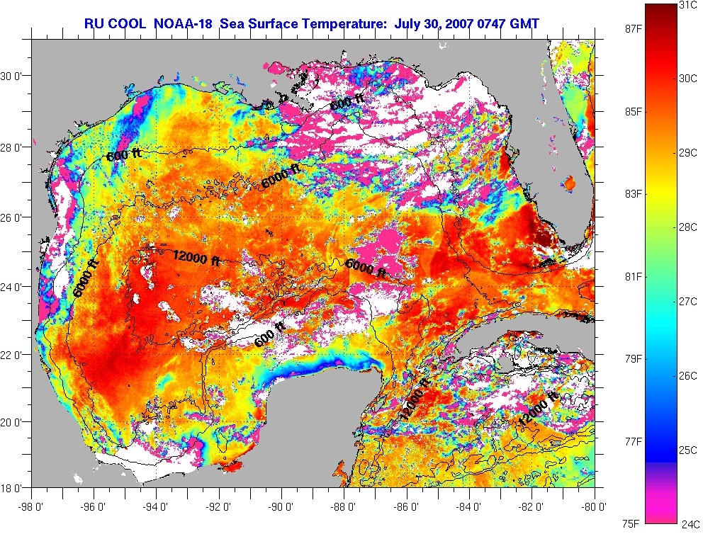

Those of you without access to Phil. Trans. can read a preprint version

Monday, July 30, 2007

There's a hot time in Marysville or how not to RTFR

Eli, as many others has been blogging about the surface station record. The pin up picture is Marysville
which "obviously shows spurious warming due to the urban heat island effect". Well, maybe not. Tamino has put up the numbers, using the GISSTEMP adjusted data that compares Marysville to nearby Orland, a rural station and shows they have the same trend over the last 30 years.


There has been lots of comment on these two stations, including Climate Audit from which the Orland figure was taken with a constant stream of stuff like this from another blog about Marysville

I can tell you with certainty, the temperature data from this station is useless. Look at the pictures to see why, and is it any wonder the trend for temperature is upward?
There are also micro mistakes
But let’s say that they got all their adjustments exactly right. What does that say about the quantum of UHI? Here’s a town of 12,000 which qualifies as “rural” in all the UHI studies.
sadly no. Steve blew that one, Marysville is NOT qualified as rural in GISS, and GISS is very clear about how rural stations are picked, by examining satellite data to find unlit areas where there are weather stations. The downside of this is that only ~250 rural stations are found in the US. Data for all the other stations is adjusted by
The urban adjustment in the current GISS analysis is a similar two-legged adjustment, but the date of the hinge point is no longer fixed at 1950, the maximum distance used for rural neighbors is 500 km provided that sufficient stations are available, and “small-town” (population 10,000 to 50,000) stations are also adjusted. The hinge date is now also chosen to minimize the difference between the adjusted urban record and the mean of its neighbors. In the United States (and nearby Canada and Mexico regions) the rural stations are now those that are “unlit” in satellite data, but in the rest of the world, rural stations are still defined to be places with a population less than 10,000. The added flexibility in the hinge point allows more realistic local adjustments, as the initiation of significant urban growth occurred at different times in different parts of the world.
Hansen, J.E., R. Ruedy, Mki. Sato, M. Imhoff, W. Lawrence, D. Easterling, T. Peterson, and T. Karl, 2001: A closer look at United States and global surface temperature change. J. Geophys. Res., 106, 23947-23963, doi:10.1029/2001JD000354
ONLY RURAL STATIONS CONTRIBUTE TO THE TREND IN GISSTEMP. Marysville has NO EFFECT on the long term trend in the GISSTEMP record.

You have to RTFR to understand what is happening. Let us look at the USHCN adjusted and the GISS adjusted data
The RAW data is below the adjusted. That means that the nearby RURAL stations are warming faster than that so called hot spot Marysville. We can also look at the simple differences to see the hinged corrections.

RTFRs folks, Eli has enough aggro.

UPDATE: Stephen McIntrye asks where it is specifically stated that only the 250 or so rural US stations are used by GISS to estimate trends. Referring to the 2001 GISS paper linked above we see in the introduction (Eli quoted this before)
Only 214 of the USHCN and 256 of the GHCN stations within the United States are in “unlit” areas. Fortunately, because of the large number of meteorological stations in the United States, it is still possible to define area-averaged temperature rather well using only the unlit stations. This is not necessarily true in much of the rest of the world.
There is also an interesting comment re land use (e.g. why not adjust for land use effects as well as UHI in Section 4.2
We provide one explanatory comment here about the rationale for trying to remove anthropogenic urban effects but not trying to remove regional effects of land use or atmospheric aerosols. Urban warming at a single station, if it were not removed, would influence our estimated temperature out to distances of about 1000 km, i.e., 1 million square kilometers, which is clearly undesirable. This is independent of the method of averaging over area, as even 5000 stations globally would require that each station represent an area of the order of 100,000 square kilometers, an area much larger than the local urban influence. On the other hand, anthropogenic land use and aerosols are regional scale phenomena. We do not want to remove their influence, because it is part of the largescale climate.
which should amuse Prof. Pielke a. D. but back to the points that SM asked about while torturing surface stations (Eli has the feeling he is not being treated well over their also). From Section 4.2.2
Indeed, in the global analysis we find that the homogeneity adjustment changes the urban record to a cooler trend in only 58% of the cases, while it yields a warmer trend in the other 42% of the urban stations. This implies that even though a few stations, such as Tokyo and Phoenix, have large urban warming, in the typical case, the urban effect is less than the combination of regional variability of temperature trends, measurement errors, and inhomogeneity of station records.
The bottom line is that since the urban and periurban stations have their temperatures adjusted so that the trends match those of the "nearby (500 km)" rural stations, the long term trend is only determined by the rural stations. The point raised in an earlier post, "Does GISSTEMP overcount rural stations"
The bottom line is that the ONLY stations which contribute to the overall trend are the RURAL stations. Moreover, rural stations near heavily settled areas will be more strongly overcounted because the trends in the few rural stations in such an area will dominate all of the stations in the area and the nearby points on the grid to which the temperature data is fit.
To put it simply, the grid point temperature anomalies may be an average over all stations in the neighborhood, but the data in the non-rural stations has been previously constrained to match the trends of the rural stations. Thus the rural trends are being added multiple times to the average. What is left is shorter time variations that average to zero over the hinged UHI spline adjustments.

In the long run it does make a difference over 100 years, but not such a large difference that it would swamp warming from forcings such as greenhouse gases, solar, etc..
The primary difference between the USHCN and the current GISS adjustments, given that the GISS analysis now adapts the USHCN time of observation and station history adjustments, is the urban adjustment. The GISS urban adjustment, as summarized in Plate 2, yields an urban correction averaged over the United States of about -0.15°C over 100 years, compared with a USHCN urban adjustment of -0.06°C. When only urban stations are adjusted the impact of our adjustment is about -0.1°C on either the USHCN stations (Plate 2j) or on the GHCN stations (Plate 2k) in the United States. When both urban and periurban stations are adjusted, the impact is about - 0.15°C.

The magnitude of the adjustment at the urban and periurban stations themselves, rather than the impact of these adjustments on the total data set, is shown in Plate 2l. The adjustment is about -0.3°C at the urban stations and -0.1°C at the periurban stations. In both cases these refer to the changes over 100 years that are determined by adjusting to neighboring “unlit” stations. The adjustments to the periurban stations have a noticeable effect on the U.S. mean temperature because of the large number of periurban stations, as summarized in Table 1.

Saturday, July 28, 2007

Slouching toward Gomorrah

Tim Lambert has an update on the hours of electricity in Baghdad. The US State Department has decided to stop reporting on this. Eli thought it would be useful to see when the lights will finally go out on the Iraqi disaster. The answer is not surprising.

Friday, July 27, 2007

The Stern Gang rides again

Eli opened up his July 13 issue of Science Magazine and read articles by William Nordhaus and Nicholas Stern on the Stern Report. There is not much new to report to those who have been following the argument. Nordhaus is still flogging his ramp

What is the logic of the ramp? In a world where capital is productive and damages are far in the future (see chart above), the highest-return investments today are primarily in tangible, technological, and human capital. In the coming decades, damages are predicted to rise relative to output. As that occurs, it becomes efficient to shift investments toward more intensive emissions reductions and the accompanying higher carbon taxes. The exact timing of emissions reductions depends on details of costs, damages, learning, and the extent to which climate change and damages are nonlinear and irreversible.
and criticizing Stern's discounting. Nordhaus assumes that most of the damages from climate change will occur after 2200, so costs in the next 200 years will be low. Under this assumption if one uses higher discount rates more typical of those in economic models

The optimal carbon tax and the social cost of carbon decline by a factor of ~10 relative to these consistent with the Stern Review's assumptions, and the efficient trajectory looks like the policy ramp discussed above. In other words, the Stern Review's alarming findings about damages, as well as its economic rationale, rest on its model parameterization--a low time discount rate and low inequality aversion--that leads to savings rates and real returns that differ greatly from actual market data. If we correct these parameterizations, we get a carbon tax and emissions reductions that look like standard economic models.

The Stern Review's unambiguous conclusions about the need for urgent and immediate action will not survive the substitution of assumptions that are consistent with today's marketplace real interest rates and savings rates. So the central questions about global-warming policy--how much, how fast, and how costly--remain open.

The last point, that market discount rates are appropriate is one that is contested by Nicholas Stern.

Many of the comments on the review have suggested that the ethical side of the modeling should be consistent with observable market behavior. As discussed by Hepburn, there are many reasons for thinking that market rates and other approaches that illustrate observable market behavior cannot be seen as reflections of an ethical response to the issues at hand. There is no real economic market that reveals our ethical decisions on how we should act together on environmental issues in the very long term.

Most long-term capital markets are very thin and imperfect. Choices that reflect current individual personal allocations of resource may be different from collective values and from what individuals may prefer in their capacity as citizens. Individuals will have a different attitude to risk because they have a higher probability of demise in that year than society. Those who do not feature in the market place (future generations) have no say in the calculus, and those who feature in the market less prominently (the young and the poor) have less influence on the behaviors that are being observed.

Another recurring point is that
The ethical approach in Nordhaus' modeling helps drive the initial low level of action and the steepness of his policy ramp. As future generations have a lower weight they are expected to shoulder the burden of greater mitigation costs. This could be a source of dynamic inconsistency, because future generations will be faced with the same challenge and, if they take the same approach, will also seek to minimize short-term costs but expect greater reductions in the future as they place a larger weight on consumption now over the effects on future generations (thus perpetuating the delay for significant reductions).
Something that Mark Thoma comments on when pointing out that Robert Samuelson plays Intellectual Three Card Monte with Lubos Motl .
In my view, Robert Samuelson is a bad person: when a carbon tax was on the agenda and we had a real window of opportunity, he fought it; now when the only things on the agenda are preference-shaping tools that I regard as very weak compared to a carbon tax, he's against them as well on the grounds that "hippie... Prius politics is... showing off" and that a carbon tax would be good. A little intellectual three-card-monte here, doncha think?
A principal values of the Nordhaus and Stern articles are links to papers and book chapters available on the net for those seeking more detail.
  1. W. D. Nordhaus, "The Challenge of Global Warming: Economic Models and Environmental Policy" (Yale Univ., New Haven, CT, 2007); available at http://nordhaus.econ.yale.edu/recent_stuff.html.
  2. W. D. Nordhaus, J. Econ. Lit., in press; available at http://nordhaus.econ.yale.edu/recent_stuff.html.
  3. K. J. Arrow et al. Climate Change 1995--Economic and Social Dimensions of Climate Change, http://nordhaus.econ.yale.edu/stern_050307.pdf
  4. T. Sterner, U. M. Persson, "An even sterner review: Introducing relative prices into the discounting debate," Working draft, May 2007; www.hgu.gu.se/files/nationalekonomi/personal/thomas%20sterner/b88.pdf
  5. C. Hepburn, "The economics and ethics of Stern discounting," presentation at the workshop the Economics of Climate Change, 9 March 2007, University of Birmingham, Birmingham, UK; www.economics.bham.ac.uk/maddison/Cameron%20Hepburn%20Presentation.pdf
  6. N. Stern, "Value judgments, welfare weights and discounting," Paper B of "After the Stern Review: Reflections and responses," 12 February 2007, Working draft of paper published on Stern Review Web site; www.sternreview.org.uk
  7. N. Stern, "The case for action to reduce the risks of climate change," Paper A of "After the Stern Review: Reflections and responses," working draft of paper published on Stern Review Web site, 12 February 2007; www.sternreview.org.uk.

Thursday, July 26, 2007

Does GISSTEMP overcount rural stations?

In a previous post, Eli quoted from Hansen, J.E., R. Ruedy, Mki. Sato, M. Imhoff, W. Lawrence, D. Easterling, T. Peterson, and T. Karl, 2001: A closer look at United States and global surface temperature change. J. Geophys. Res., 106, 23947-23963, doi:10.1029/2001JD000354 as to how the GISSTEMP team adjusts urban data

The urban adjustment in the current GISS analysis is a similar two-legged adjustment, but the date of the hinge point is no longer fixed at 1950, the maximum distance used for rural neighbors is 500 km provided that sufficient stations are available, and “small-town” (population 10,000 to 50,000) stations are also adjusted. The hinge date is now also chosen to minimize the difference between the adjusted urban record and the mean of its neighbors. In the United States (and nearby Canada and Mexico regions) the rural stations are now those that are “unlit” in satellite data, but in the rest of the world, rural stations are still defined to be places with a population less than 10,000. The added flexibility in the hinge point allows more realistic local adjustments, as the initiation of significant urban growth occurred at different times in different parts of the world.
In the US, they used satellite observations of night lights to define what are rural, suburban and urban areas:
The percent of brightness refers to the fraction of the area-time at which light was detected, i.e., the percent of cloud-screened observations that triggered the sensor. These data are then summarized into three categories (0-8, 8-88, and 88-100%). From empirical studies in several regions of the United States, Imhoff et al. associate the brightest regions (which we designate as “bright” or “urban”) with population densities of about 10 persons/ha or greater and the darkest (“unlit” or “rural”) regions with population densities of about 0.1 persons/ha or less. As is apparent from Plate 1b, the intermediate brightness category (“dim” or “periurban”) may be a small town or the fringe of an urban area.
after this classification the number of rural stations in the US is reduced to 214 USHCN stations and 256 of the GHCN stations (obviously a lot of duplication here)
As the contiguous United States covers only about 2% of the Earth’s area, the 250 stations are sufficient for an accurate estimate of national long-term temperature change, but the process inherently introduces a smoothing of the geographical pattern of temperature change.
Outside of the US, they continue to use population data to define rural stations.

The bottom line is that the ONLY stations which contribute to the overall trend are the RURAL stations. Moreover, rural stations near heavily settled areas will be more strongly overcounted because the trends in the few rural stations in such an area will dominate all of the stations in the area and the nearby points on the grid to which the temperature data is fit.

Tuesday, July 24, 2007

UHI demythifications

Steve Bloom and Hank Roberts points out that Control Climate Change copied their post which Eli linked to in the original post here, verbatim from Real Climate.

http://www.realclimate.org/index.php/archives/2007/07/no-man-is-an-urban-heat-island/#

Control Climate Change has a notice at the bottom of their web page
http://www.controlclimatechange.com/2007/07/20/no-man-is-an-urban-heat-island/

copy; 2007 Control Climate Change and Crossbow Communications. All Rights Reserved.
Since they copied Real Climate's work without permission, they clearly cannot claim copyrights or any rights about the text. Crossbow Communications is a public relations firm located in Denver run by one
Gary Chandler
Crossbow Communications
PO Box 101413
Denver, Colorado 80250
303-278-2865
gary@crossbow1.com

Crossbow claims success in placing agitprop in a number of newspapers. They have represented mining and agricultural interests in the past. It was very naughty of them and I am not sure what is going on. I have written to them and we will see. Apologies. Paranoids are often right.

UPDATE: Hank got deeper into this while Eli was changing the post. See the comments.

17 myths demythtified

Brian Angliss provides a thorough demythtification of 17 myths that denialists hold dear. Tip of the ears to Atmoz for the link

  • DENIAL CLAIM #1: The source of all the CO2 in the air is out gassing from the mantle
  • DENIAL CLAIM #2: The source of the CO2 in the air is thermal heating of the ocean causing dissolved gases like CO2 to come out of solution and enter the atmosphere
  • DENIAL CLAIM #3: We don’t know for sure where the added CO2 in the atmosphere is coming from, but it’s not from human consumption of fossil fuels
  • DENIAL CLAIM #4: CO2 rates are rising only 0.38% per year, not the 1% per year called out in the Third IPCC assessment report (TAR)
  • DENIAL CLAIM #5: CO2 is a sufficiently weak greenhouse gas that it could not be responsible for the level of climate change being modeled and observed
  • DENIAL CLAIM #6: There is no correlation between CO2 in the atmosphere and the temperature, since 450 million years ago was the coldest in 0.5 billion years and also had the highest CO2 concentrations
  • DENIAL CLAIM #7: The Medieval Warm Period/Medieval Climate Anomaly (MWP) was warmer than conditions today
  • DENIAL CLAIM #8: The MWP has been ignored in order to produce the desired conclusion
  • DENIAL CLAIM #9: The temperatures we’re experiencing in the later part of the 20th century are a result of the global climate finally coming out of the Little Ice Age
  • DENIAL CLAIM #10: There was a significant period of global cooling between the 1940s and the 1970s. This cooling period existed as anthropogenic CO2 levels were rising significantly. If anthropogenic CO2 is more important than natural drivers, then this cooling period would not exist, yet it does
  • DENIAL CLAIM #11: Cosmic rays (very high energy particles) striking the Earth’s atmosphere is the cause of global heating
  • DENIAL CLAIM #12: The Stefan-Boltzmann Law (the relationship between radiation and temperature of an ideal “black body” radiator) breaks the calculations required to make global heating work
  • DENIAL CLAIM #13: Using computer models is inherently inaccurate, especially of long-term changes in a system as complex as the Earth’s global climate
  • DENIAL CLAIM #14: The Earth hasn’t warmed by the expected amount predicted in the IPCC TAR, and papers have suggested that oceanic storage of heat is the reason. However, the only part of the ocean that matters as a “thermal sink” for atmospheric heating is the top few meters and yet the calculations performed require that 1.25 miles of ocean are available as a “sink” to make the math work out. Unfortunately, deep ocean temperatures haven’t changed at all
  • DENIAL CLAIM #15: The ocean has already begun to cool as expected given recent changes in solar output, cosmic solar rays, etc.
  • DENIAL CLAIM #16: Global heating isn’t actually happening because satellite measurements of tropical temperatures have not been rising like directly-measured temperatures in the tropics
  • DENIAL CLAIM #17: Some deniers don’t directly dispute that global heating is happening or that humans are the cause. Instead, they claim that global heating might just be good for the human race

Sunday, July 22, 2007

Our far flung correspondents write:

BATON ROUGE looks like a great site. No pavement. No AC. No shelter. NONE of the issues that plague the sites those denialists are putting a spot light on. This looks like a great site. This looks like a site that meets the CRN guidelines. The great thing about this kind of site is you dont have to make adjustments. It follows standards. Can you please do the following.
  • Download the giss RAW data for this site.
  • Download the Giss adjusted data. Difference these to see what Hansen did to this COMPLIANT site.
  • Post the adjustment and explain it.
  • Otherwise, back in your hole rabbett.
Ever the pleasing bunny, Eli went to the GISSTEMP site and downloaded the data for Baton Rouge. Then he plotted the raw and adjusted data on the same graphand so, as per request he plotted the differences

And then the EverReadyRabettTM went to the NOAA data center site and read the station history and used the map to see where it had moved. Eli noted that the airport weather station only opened in 1932, and the location moved in 1945, 1978 and finally in 1995. The original airport was pretty much in the center of town (to the east of the river, use the map). In 1945 it moved a considerable distance to the north. Certainly pictures from 2007 don't tell us much about any of this, but the station history helps considerably.

Interestingly, the first record from the airport station(s) is from 1932, but the GISS record goes back to 1889!?


you ask with interest **. Well, little mouse we may not be able to answer that completely, but if you download data from the Global Historical Climate Network, yes, the information from the Baton Rouge station does extend back to 1888 (Its a big download out there, don't do this trick on a 26kB modem. The BR station ID is 425722310090) and, Eli notes that there are several stations in the area that opened at the same time, including a number of rural stations.

The data sets incorporated into the GHCN reports are tested and corrected as described in two publications:

Peterson, T.C., and R.S. Vose, 1997: An overview of the Global Historical Climatology Network temperature database. Bulletin of the American Meteorological Society, 78 (12), 2837-2849. (PDF Version)

Peterson, T.C., R. Vose, R. Schmoyer, and V. Razuvaev, 1998: Global Historical Climatology Network (GHCN) quality control of monthly temperature data. International Journal of Climatology, 18 (11), 1169-1179. (PDF Version)

Frankly Eli cannot resist quoting from the introduction of the second of these which truly shows the difference between amateurs and pros
In the process of creating GHCN, cautionary remarks were made that cast doubt on the quality of climate data. For example, a meteorologist working in a tropical country noticed one station had an unusually low variance. When he had an opportunity to visit that station, the observer proudly showed him his clean, white instrument shelter in a well cared for grass clearing. Unfortunately, the observer was never sent any instruments so every day he would go up to the shelter, guess the temperature, and dutifully write it down. Another story is about a station situated next to a steep hillside. A few of meters uphill from the station was a path which students used walking to and from school. On the way home from school, boys would stop and...well, let’s just say the gauge observations were greater than the actual rainfall. In the late 1800s, a European moving to Africa maintained his home country’s 19th Century siting practice of placing the thermometer under the eaves on the north wall of the house, despite the fact that he was now living south of the equator. Such disheartening anecdotes about individual stations are common and highlight the importance of QC of climate data.
While several commentators are enjoying a good piss on air conditioners and grills, those little boys are at least not doing the same on the stations, or at least not as yet, that we know of.

The point is that one can recover a data set with care and professional experience. Details of how the GHCN data is tested can be found in the two references.
Historically, the identification of outliers has been the primary emphasis of QC work (Grant and Leavenworth, 1972). In putting together GHCN v2 temperature data sets (hereafter simply GHCN) it was determined that there are a wide variety of problems with climate data that are not adequately addressed by outlier analysis. Many of these problems required specialized tests to detect. The tests developed to address QC problems fall into three categories. (i) There are the tests that apply to the entire source data set. These range from evaluation of biases inherent in a given data set to checking for processing errors; (ii) this type of test looks at the station time series as a whole. Mislocated stations are the most common problem detected by this category of test; (iii) the final group of tests examines the validity of individual data points. Outlier detection is, of course, included in this testing. A flow chart of these procedures is provided in Figure 1. It has been found that the entire suite of tests is necessary for comprehensive QC of GHCN.
So the Rabett traipsed over to Broadway and visited GISS, where he read that the various adjustments to the GHCN and USHCN data are described most recently in

Hansen, J.E., R. Ruedy, Mki. Sato, M. Imhoff, W. Lawrence, D. Easterling, T. Peterson, and T. Karl, 2001: A closer look at United States and global surface temperature change. J. Geophys. Res., 106, 23947-23963, doi:10.1029/2001JD000354.

In particular, to the questions of dear reader, Eli discovered that there is an
4.2.2. Urban adjustment. In the prior GISS analysis the time series for temperature change at an urban station was adjusted such that the temperature trends prior to 1950 and after 1950 were the same as the mean trends for all “rural” stations (population less than 10,000) located within 1000 km (with the rural stations weighted inversely with distance). In other words it was a two-legged adjustment with the two legs hinged at 1950 and with the slopes of the two lines chosen to minimize the mean square difference between the adjusted urban record and the mean of its rural neighbors.

The urban adjustment in the current GISS analysis is a similar two-legged adjustment, but the date of the hinge point is no longer fixed at 1950, the maximum distance used for rural neighbors is 500 km provided that sufficient stations are available, and “small-town” (population 10,000 to 50,000) stations are also adjusted. The hinge date is now also chosen to minimize the difference between the adjusted urban record and the mean of its neighbors. In the United States (and nearby Canada and Mexico regions) the rural stations are now those that are “unlit” in satellite data, but in the rest of the world, rural stations are still defined to be places with a population less than 10,000. The added flexibility in the hinge point allows more realistic local adjustments, as the initiation of significant urban growth occurred at different times in different parts of the world.
That sounds a lot like what the differences between the raw and adjusted data shown above and upon which our correspondent inquired, but still, why the 0.1 C steps in the adjustment

GHCN data is reported in 0.1 degree increments.

RTFR.

** Thanks to R. Ruedy at GISS for a prompt and informative response to our inquiry.

Thursday, July 19, 2007


Climate Chaos Lab Rats

Linked to at Coby Beck's Illconsidered. In which the important questions of our time are answered

Tropopausing

Eli has been fooling with his Spectra Calc Carrot. This started as an effort to see where the mixing ratios of carbon dioxide exceeds that of water vapor, which as you can see below, ranges from 5 km to about 10, depending on location and time of year. The mixing ration for CO2 is constant in the troposphere and stratosphere (and even higher)

It is pretty well known that the tropopause is highest in the tropics and coldest


but the bunnies found something interesting, which we assume is well known to those who actually work on this stuff, but whose implications have yet to become clear. The thickness of the region of lowest temperature between the troposphere and the stratosphere is greatest at high latitudes and thinnest at the equator.

If nothing else this should have an effect on water vapor and other condensible gases crossing the barrier.

Wanna see some pictures lil' girl?


UPDATE: This has morphed into a series of posts on how GISS calculates trends. In short, only rural stations contribute to the trends.Ethon on his way to Hamburg, flew in and out of a bunch of airports. You can't get here from there anymore, and if you fly cheap, you end up in the strangest places. Always willing to do a good turn for our friends over at Climate Audit (UPDATE: The link to the pictures appeared on CAs list of station data) , Climate Science, and Anthony Watt's Surface Stations, Eth used his brownie, and got a few pics (click on the link to the photos on the right) of about 209 surface stations that he thought he would share. Not all are USHCN stations but the data is at the NOAA archive and used by GISS. These are currently part of the US National Weather Service (NWS) Automated Surface Observation Stations (ASOS) system although many go back before automation. We hope the co-respondents will send some liverwurst sandwiches over, the food on the trans-Atlantic red-eye sucks.


Baton Rouge Airport


Islip, NY


Dulles (Washington, DC)

Yeah, Eli knows, it's really on the NOAA site with a lot more information on the USHCN and other stations. The cartoon is by Gahan Wilson and you have until the 22nd to enter the New Yorker cartoon caption contest. Something like Roger Pielke Sr. dictates about surface climate stations to Steve Sadov while the rest of the Climate Audit crowd cheers would probably be too obscure.

Tuesday, July 17, 2007

The bunny curve

Kristen Byrnes has thrown in the towel,

UPDATE: The green line in the graph above is incorrectly drawn over the temperature graph. The temperature graph itself can no longer be trusted anymore because of the problems with the temperature stations (see follies in measuring global warming). Hopefully the problems with the temperature stations will be fixed soon and I'll see if I can find someone who can draw with a mouse better than me.
So the mice decided to help and drew the bunny curve, which really needs to be clicked on to be appreciated.


Eli has entered this in the Alex Higgens competition, open at Deltoid
To find the most intense, most unembarassed self-pitying whinge from an AGW denialist...
Vote early, vote often

Sunday, July 15, 2007

John hits for the cycle.

John Fleck has two of the greatest stories of the year.

Thursday, July 12, 2007

How well can we model pressure broadening?

The mice clamored for actual examples of pressure broadened lines and how well they could be fit. This is a fairly specialized area, and papers appear in a very small number of journals, principally the Journal of Quantitative Spectroscopy and Radiative Transfer, the Journal of Molecular Spectroscopy, Molecular Physics and Applied Optics. Eli went and downloaded some papers from JQSRT about line broadening in CO2.

These are two examples from a diode laser spectrum of L. Joly, et al., "A complete study of CO2 line parameters around 4845 cm-1 for Lidar applications. JQSRT (2007), doi:10.1016/j.jqsrt.2007.06.003. The spectrum and the fit are shown in the top panels the residuals are shown in the bottom two panels for Voigt and Rautian profiles respectively. In this case the Rautian is better than the Voigt. In both cases the P12 line of the (201) <-- (000) transition is shown, on the left at 70 mbar, 292 K, on the right at 564 mbar, 291 K. Note the different scales on the frequency axes. The scale for the spectrum on the right is four times larger than for that on the left. UPDATE: The full width at half maximum (FWHM) of the line on the right is about four times larger than that on the left. The x-axis scales in the two graphs are different.


Next we can look at an example from V. Malathy Devia, D. Chris Benner, M.A.H. Smith, and C.P. Rinsland, "Nitrogen broadening and shift coefficients in the 4.2–4.5-m bands of CO2" JQSRT 76 (2003) 289–307 showing 20 calculated spectra (bottom panel) and the residuals between the calculated and observed spectra (upper panel). This includes self broadening and broadening due to N2. The cell has a mixture of 12C and 13C CO2. In this case Voigt profiles were used. The largest line is P(30) for the 12CO2 (001) <-- (020) band. There is also an R(28) line from 13CO2. The broadening depends on the rotational quantum number, the and the pressure. Details can be found in the paper and are included in HITRAN.

UPDATE: If you want to learn about temperature effects see here and for more on pressure broadening see here and here

Wednesday, July 11, 2007

AlGorithms

There is a long history of Al Gore being right on many issues and being ridiculed for it. Such things are known as AlGorithms and are recited at night by good little girls and boys in the right households. Bob Somerby has been howling almost daily about this, visit his incomparable archives and read some of his many posts about the quintessential AlGorithm, the INTERNET story.

Previously we had discussed how a falsification in Byrnes review of "An Inconvenient Truth" provided the heavy artillery she used to attack Gore. Rather free form discussion broke out here, at Stoat and Deltoid. Big City Liberal has used the opportunity to post a pin up picture of Richard Tol who is the most serious of Byrnes' defenders.

Here we report on one of Kristen Byrnes' many AlGorithms.

Next, Al gets right to business showing some of the worlds receding glaciers. According to the national Snow and Ice Data Center, most glaciers around the world are receding. But when you look at scientific studies on individual glaciers you begin to understand that temperature is not always the cause and that all of the glaciers that Al mentions have been retreating for over 100 years.


There is then a paragraph about Kilimanjaro and one about the Grinnell Glacier. Kilimanjaro I leave to Ray Pierrehumbert who explains why Ms. Byrnes really should have RTFRs she provides before opining. But in both cases and in the case discussed below, a major part of the refutation is that CO2 mixing ratios and temperatures did not start increasing 100 years ago. The graphs in Eli's previous post show that CO2 concentrations started rising about 150 years ago, accelerating in the past 50 and one can say roughly the same about global surface temperature anomalies (yes we know that aerosols arrested the warming btw ~1940-70). Ms. Byrnes continues
Himalayas - Glaciers have been found to be in a state of general retreat since 1850 (Mayewski & Jeschke 1979). In this section he also claims that 40% of the worlds population gets half of their water from streams and rivers that are fed by glaciers. This is an easily confused claim. Rivers that are fed by the Himalayas get most of their run-off from the spring snowmelt. They also have many dams that ensure that water will be available during dry months.
Gore wrote in "An InconvenientTruth" (The tech squad finds it easier to quote from a book)
The Himalayan Glaciers on the Tibetan Plateau have been among the most affected by global warming. The Himalayas contain 100 times as much ice as the Alps and provide more than half of the drinking water for 40% of the world's population -- through seven Asian river systems that all originate on the same plateau.

Within the next half-century, that 40% of the world's people may well face a very serious drinking water shortage, unless the world acts boldly and quickly to mitigate global warming.
The seven rivers are the Indus, Ganges, Brahmaputra, Salween, Mekong, Yangtze and Yellow. Geographers can argue about where the plateau starts and ends, how many people use the river water, what percentage comes from melt, and other details, but we read in the IPCC WG II Summary for Policymakers says:
Glacier melt in the Himalayas is projected to increase flooding, and rock avalanches from destabilised slopes, and to affect water resources within the next two to three decades. This will be followed by decreased river flows as the glaciers recede. * N [10.2, 10.4]
The full report is not yet available (there is a story there, as the meeting that lead to the SPM for WG II was particularly contentious with the US and China demanding many changes to soften the impact.). From a draft of the Technical Summary we read that scientists are highly confident that global warming will make water shortages a major issue for Asia in the next 100 years especially because of rapid melting of glaciers.

The Himalayan glaciers will melt even more rapidly then they currently are (which is fast enough, see below) because of increasing temperatures. At first there will be increased flooding and avalanches which will interfere with water supplies as the glacial water floods down onto the plains. Once the glaciers are all or mostly gone the river flow will seriously decrease.

McClatchy News Service reports the IPCC has said that
"Glaciers in the Himalayas are receding faster than in any other part of the world and, if the present rate continues, the likelihood of them disappearing by the year 2035 and perhaps sooner is very high if the Earth keeps getting warmer at the current rate," the report said. The total area of glaciers in the Himalayas likely will shrink from 193,051 square miles to 38,600 square miles by that year, the report said.
in Geography News from January of this year
Glaciers of the Himalaya Mountain Range are an enormous reservoir of fresh water and their meltwater is an important resource for much of India, Bangladesh, Pakistan, Nepal, Bhutan, China and Burma. A team of Indian scientists lead by Anil V. Kulkarni of the Indian Space Research Organization, studied surface area coverage for nearly 500 glaciers in the Chenab, Parabati, and Baspa basins using satellite data collected between 1962 and 2001.

They documented that most of these glaciers have retreated significantly. In 1962 a total of 2077 square kilometers was covered by glaciers and in 2001 that area was reduced to 1628 square kilometers. This represents a deglaciation of over twenty percent over a forty year period.
They also learned the the number of glaciers actually increased in this area. The increase in count was caused by fragmentation. Climate change was blamed for the decrease in sustainability for these Himalayan glaciers.
The paper itself concludes:
The observations made in this investigation suggest that small glaciers and ice fields are significantly affected due to global warming from the middle of the last century. In addition, larger glaciers are being fragmented into smaller glaciers. In future, if additional global warming takes place, the processes of glacial fragmentation and retreat will increase, which will have a profound effect on availability of water resources in the Himalayan region.
The threat is so large that India and China, sort of the Michael Mann and Steve McIntyre of countries, have agreed to cooperatively map the glacier melt on the Tibetan Plateau, an area both of them consider to be of the highest strategic importance, often close to outsiders for security reasons, have fought wars over and frequently use to engage in small and larger armed battles.

UPDATE: Finally, you should go over to Open Mind by Tamino and read his post on glacier retreat. Tamino has taken the time to RTFR (the Glacier Balance Bulletin for the World Glacier Monitoring Service) and provides (among many other things and important links) a graphic summary showing that anyone who tells you glaciers are not retreating, is on balance, someone not to buy a bridge connecting Manhattan and Brooklyn from.

*The map at the top is from www.globalwarmingart.com.

Monday, July 09, 2007

Ponder the Maunder

UPDATE: Those of you coming in from Climate Audit and Science Blogs might like to take a look at our post on AlGorithms, Himalayan glaciers, Strawmen (new New NEW) and the good Ms. Byrne after reading this.

Tony at Deltoid points to a web site put together by a young lady, Kristen Byrnes, in Portland as a refutation of the IPCC AR4.

I'm disappointed no one talked about "Ponder the Maunder", the extra credit assignment of a 15-year-old student that rips one in the global warming scam. It just goes without saying that a school project is far more trustworthy than anything coming out of the IPCC. James Hansen is paid lots of money!
Richard Tol is a great fan thinking her more accurate than the Stern Report and Inconvenient Truth.
If a 15-yr-old can punch tiny holes, then all credibility is gone. Anyone who does not want to believe Al Gore's message, just has to point to Kristen Byrnes and say "ha ha, he cannot even hold his own against a school kid". Debate over.
Ms Byrnes is now using her new found popularity to establish the Kristen Byrnes Science Foundation. This being the case, google first lead Eli to the Kristen Byrnes Science Foundation review of an Inconvenient Truth, as good a place to start as any. A key point in Ms. Byrnes' argument is that
Al then shows global temperatures for the past 100 years using a graph similar to the one below. “In any given year it might look like it’s going down but the overall trend is extremely clear” I’ve added the green line, which is CO2 . What Al does not show you is that most of the warming started before the CO2  increase. He also fails to mention the cool period between 1944 and 1976 does not correlate with greenhouse theory; the globe should have been warming at that time


Each of the large divisions on the right of Ms. Byrnes' graph would correspond to about 20 ppm CO2 . Now that green line looked awfully familiar to the bunnies, a flat line with a little bump to the left and a sharp rise to the right, so we started looking for graphs of CO2  concentrations as a function of time, and we found this one in a pretty good presentation by Steven Schwartz (PS it is also in the TAR, but not nearly as prettified.)The shape of the CO2 mixing ratio that Ms. Byrnes added is the same, the only problem is that her curve starts in 1880, using the data from 800. A millenia among friends is not a big deal, but if you look at the curve immediately above you see that the CO2 mixing ratio actually started to rise ~ 1800 not at 1940 as in Ms. Byrnes' addition, which she specifically says she added by herself.

UPDATE2: By popular (and unpopular) demand, Eli has been asked to plot the NOAA temperature anomalies and the CO2 mixing ratios on the same figure. The temperature data is that from NOAA contained in an ftp file. The CO2 information comes from Carbon Dioxide Information Analysis Center. The Mauna Loa CO2 measurements are shown as a purple line. The Law Dome ice core CO2  measurements are shown as brown triangles and the Siple ice core measurements as green squares. The reader can see this figure more clearly by clicking on it.


Jules Virdee (and also here) and Judith Curry gave good advice in a very nice way at Climate Audit and Eli held off to see if it would be accepted, but sadly no, they got junior high attitude just as Eli did.

It is worth spending a minute or two with the actual CO2  rise. The first part of the rise comes from land use changes, particularly the settlement of the American west, and parts of South America and Australia. Industrialization only starts to bite about 1850-1900, a point that is often lost.

Finally we can look at the relationship between CO2 mixing ratio and global surface temperature anomaly in a figure from the Pew Center on Climate Change


So unfortunately we are left with a number of questions about the source of this error, upon which the edifice is built and is this astroturf?

For a discussion of Ms. Byrnes' cherry picking on the slopes of Kilimanjaro, there can be no better read than Ray Pierrehumbert's discussion of tropical glacier retreat.

UPDATE: Hans Erren rightly points out that Eli, lazy Rabett that he is, has copied graphs showing the concentration of CO2  to compare with global temperature anomalies rather than the CO2 forcing which is proportional to the logarithm of the concentration. Bad bunny. Steven Schwartz's presentation linked above has the appropriate information

Sunday, July 08, 2007

High Pressure Limit. . . .


This is a continuation of playing with Eli's new chewy carrot colored Spectral Calculator toy the mice left in the burrow. A couple of days ago, the Rabetts looked at the effect of pressure, and before that temperature on CO2 bending mode absorption spectrum. Eli remarked on the fact that the peak of the pressure broadened absorption stays at about the same level for a constant volume mixing ratio above 50 mbar total pressure. This means that the peak of the absorption stays the same while the line gets wider, for example at 100 mbar and 1000 mbar total pressure and 380 ppm volume mixing ratio


The mice had a nice chatter about this. Eli wants to use this as a jumping off point.

There are three relevant line widths. The natural line width, which is a measure of the vibrationally excited state radiative lifetime and the associated uncertainty spread in the energy level. For vibrational lines these are sub MHz.

Since spectroscopy goes back and forth between MHz (very high resolution, microwave spectroscopy) and cm-1 (IR, visible, UV spectroscopy) we need an equivalence. Simply divide 1 MHz by the speed of light in cm/sec, 3 x 10^10 finding that 1 MHz is equivalent to 3.3 x 10^-5 cm-1.

The shape of the natural (isolated/no collisions) line is Lorentzian (from Wolfrum Mathworld).


where the Gamma (the thing like the hangman uses) is the full line width at half maximum (FWHM).

The second linewidth that we have to worry about is the Doppler width. Doppler broadening is a shift in frequency when something (the molecule) is moving towards you (increase) or away from you (decrease). For emission or absorption of light the shift will be wo(1+v/c) where wo is the frequency of absorption/emission in the rest frame, v the speed along the direction the photon moves in and c the speed of light. When you average over all possible directions of molecular motion, this turns out to be Gaussian


We can estimate the Doppler linewidth. The translational energy of the molecule is Et= 3/2 kT, where k is Boltzmann's constant, 1.38 x 10^-23 kg-m^2 /K-s^2. This yields Et= 6.2 x 10^-21 J, but we also know that Et= 1/2 m v^2, so v = sqrt(2Et/m) where m is in kg. The mass of one CO2 (C= 12 g/mole, O=16 g/mole. If you want to do this to four significant figures you don't have the one tru back of the envelope koan) molecule is 0.044 kg / 6.02 x 10^23 molecules/mole and we get that the velocity is ~ 400 m/s.

The speed of light is 3 x 10 ^8 m/s so v/c is 1 x 10^-6. For a 600 cm-1 transition (CO2 bend) this is about 1 x 10^-3 cm-1 or 30 MHz. The Doppler width varies directly with the frequency of the transition, so a transition at 6000 cm-1 would have a Doppler width that is ~300 MHz at room temperature.

Finally the line shape associated with collisional line broadening is also Lorentzian. The natural and collision broadened line shapes can be simply combined by setting the line width equal to the sum of the radiative and collisional terms. The collisional term is proportional to the total pressure in the binary collision limit (atmospheric, unless you deep down in Jupiter). The higher the pressure, the more collisions. Remember this.

Combining the Gaussian Doppler broadening with the Lorentzian radiative and collisional terms is trickier. The solution was first found by Armstrong, and is called the Voigt line profile. However, it should be clear that if the collisional broadening is >> than the Doppler broadening (0.001 cm-1 @ 300 K for the CO2 bend) and the Doppler broadening is >> the natural line width, we can neglect the foofaw and treat the line profile as a Lorentzian whose width is aP where a is a constant for broadening of CO2 lines by air (there is some dependence on rotational state, some non-linear component, but remember this is back of the envelope)

The integral of the Lorentzian profile across all frequencies is unity (1). The total absorption of the line whether broadened or not will be Abs = A PCO2 L where A is the line absorption, PCO2 the partial pressure of CO2 and L the path length. PCO2 = VMR P where P is the total pressure and VMR is the volume mixing ratio.

At line center (substitute x = xo) into the Lorentzian formula the magnitude of the maximum is

The maximum absorption is Abs x L(xo). Substituting for Abs and Gamma we get

Max Abs = 2 A VMR P/ π α P = 2 A VMR/ π α

A is the integrated line absorbance for unit pressure, α the linear line broadening coefficient and VMR the volume mixing ratio.

If you go to very low pressures, the Doppler broadening approaches the pressure broadening and this approximation no longer works, but for tropospheric and stratospheric pressures it is fine.

Friday, July 06, 2007

Pinatas!!

Not only excellent wine but Australia has got to be the home of the world's best Pinatas. Jennifer Marohasy brings word of the Lavoisier Group 2007 Meeting to Rehabilitate Carbon Dioxide. Even better, they have posted the presentations!! Have a whack!

Thursday, July 05, 2007

Throwing in the towel

One of the things that you learn is that no one every gives up in public, but it is pretty easy to see when the game is over, people are thinking about picking up their marbles and leaving town. Stoat points to a new article to be published in the Proceedings of the Royal Academy showing that Svensmark and others of the solar driven have no clothes, all indicators of solar activity having fallen while the global temperature rises. Pete DeCarlo has the Nature comment on this. What stands out is the towel being thrown into the ring.

On other timescales however, Sun-climate links may remain worthy of study. "Climate change is a cocktail of many effects," says Jasper Kirkby, a physicist at CERN, the European particle physics laboratory near Geneva Switzerland, who is leading an experiment aimed a simulating the effect of cosmic rays on clouds. "Past climate changes have clearly been associated with solar activity. Even if this is not the case now, it is still important to understand how solar variability affects climate"
UPDATE: The Sloan and Wolfendale paper trashing Marsh and Svensmark, referenced by Tim Lambert is available at the Arxiv. The PRA article is yet to come

NOAA The Fish and Wildlife Service muzzles the polar bears

Michael Tobis has spotted (Michael also points out that it was not NOAA) another case in which NOAA the Fish and Wildlife Service is muzzling its scientists, restricting travel by and limiting what they can say to the administration position. Michael is quite subtle about it.

Scientists representing the Soviet Union traveling overseas were enjoined from mentioning certain technical topics that might reflect negatively on soviet socialism, and were required to refer any questions about those polar bears to their accompanying commisar.
Go read the underlying documents, which among other things say
The Service traveler, Mrs. Hohn, will be participating in an Arctic Council's Senior Arctic Official meeting as a member of the U.S. Delegation, and as the U.S. National Representativte to the Conservation Arctic Flora and Fauna Working Group. This trip will include Mrs. Hohn stopping in Trondheim on the way to Tromso, to confer with the Norwegian CAFF National Representative on the narrower questions of which chapter or chapters of the Circumpolar Biodiversity Monitoring Plan Norway may be able to provide lead or co-lead authors for. There will be no discussion of polar bears, sea ice, or climate change at this meeting. Mrs. Hohn understands the administration's position on climate change, polar bears, and sea ice and will not be speaking on or responding to these issues.

Pressure Broadening


Eli has been a happy hare with the new chewy carrot colored Spectral Calculator toy the mice left in the burrow. He is digging out the effects of increasing CO2 concentrations on the greenhouse effect from the spectroscopic point of view. Recent posts on Real Climate by Spencer Weart and Ray Pierrehumbert touched this off, and, of course Motl's folly aggravated the lab bunnies beyond the breaking point. Yesterday Eli looked at the effect of temperature on the CO2 bending mode absorption spectrum. Today we are under pressure. If you don't know much about pressure, you could do a very lot worse than looking at our mob blogging friend Tamino's Introduction to the Gas Laws and his post on Pressure and Height, how pressure varies with altitude.

P(z) = Po exp (-g u z/ kT)

where z is the altitude, g the gravitational constant acceleration due to gravity, u the average mass per molecule, T the temperature and k Boltzmann's constant. As Tamino points out, what we call the scale height is the altitude at which guz/ kT = 1 and the pressure is exp(-1) or 36% of the pressure at sea level, Po. This altitude is ~8.5 km.

We will use the Spectral Calculator to look at this. First, let us look at the 300 K CO2 absorption spectrum (mice wanting to play along should fire up Spectral Calculator and follow the instruction in the preceding post on Temperature
We want to select a couple of lines from this, so after setting all the parameters as before (CO2 gas, the O(16)C(12)O(16) isotopomer, 10 cm cell length, 296K, 100 mbar total pressure, 0.000380 volume mixing ratio CO2) go to the observer page and set the upper and lower wavelength ranges as 680 and 684 cm-1. You will then see this spectrumIf we now increase the total pressure to 1000 mbar (~one atm), keeping the mixing ratio constant the result isand looking carefully (you might have to click on each graph to bring up full screen images) we see that the transmission at each of the peaks in both spectra is ~93% (7% of the incident light is absorbed).

Wait a minute. The volume mixing ratio in both spectra is 380 ppm. The total pressure in the first case was 100 mbar. The total pressure in the second case was 1000 mbar, ten times greater. That means that the amount of CO2 is ten times greater. We can, of course, keep the amount of CO2 constant by decreasing the mixing ratio in the second case to 38 ppm.Transmission at the line centers is not 99.3%!. If we carefully integrated under each peak in this spectrum and the one taken at 100 mbar the integrated amount of absorbed light would be the same, just that the peaks are wider and shorter at 1000 mbar. Total absorption does not increase due to pressure broadening (within limits, see below), but it is spread to a wider range of frequencies /wavelengths.

Finally a bit of ear waving about the origin of the pressure broadening. An isolated molecule's energy levels are shifted slightly when another atom or molecule nears and their electric fields interact. This changes the wavelengths at which molecules can absorb or emit. At low pressures only a relatively few molecules will collide at any instant, and pressure broadening occurs in the so called binary collision limit.

One can order the strength of electric interactions as ion > dipole > neutral. As a general rule, broadening by an ion is much longer range and stronger than broadening by a neutral. Broadening by a molecule with a permanent dipole moment stronger than broadening by one without. O2, because it has a magnetic moment in the ground state (two unpaired electrons) will be more effective as a broadener than nitrogen.

Having simplified all this, Eli will now point to the brier patch where there are lots and lots of nettles to sting you. First, as the molecules pass near to each other, the interaction will mix nearby quantum states. Transitions can borrow strength from each other and the absorption coefficients in each line can change. Second, collisions are of finite duration and range, which has the effect of decreasing intensity in the wings and increasing that at line center. Third, if absorption is observed for a relatively long path length (km) and for a molecule with a relatively high mixing ratio (CO2, H2O) absorption due to broadening can be significant 30 cm-1 or more away from the line center.

Now THAT would be a post.

UPDATE: If you want to learn about temperature effects see here and for more on pressure broadening see here and finally here